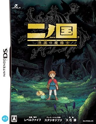
The Wizard of Oz: Beyond the Yellow Brick Road
Nintendo DS
Reviewed: 10/09/2009

The Wizard of Oz: Beyond the Yellow Brick Road is set up as a floor-based dungeon crawler. Each “floor” (an ironic term for areas which are almost entirely outdoors) consists of many long, often winding pathways. This would seem like an odd setup in most RPGs, but it’s mostly put together this way to accommodate the game’s “trackball” movement system. The lower screen displays a big green ball of sort which players must stroke with the stylus. Dorothy then responds by walking or running (depending on the speed of the spin) in the direction the ball is going. Want to walk slowly to the right? Take some slow swiped of the DS pen from left to right. Want to dash straight ahead? Start zipping that mofo from bottom to top. When the player stops, Dorothy doesn’t — not until the ball loses momentum and slows down. If players want Dorothy to come to a screeching halt, they can hold the stylus still on the screen to stop the trackball, hence stopping Dorothy.
This system is all well and good for a while, but over time, it starts to lose its charm. Dodging the visible enemies in order to avoid battle can be a tactical decision or simply a time-saving preference of the player, but the trackball impedes the ability to get one’s Barry Sanders on. Yes, the idea of momentum-based movement is great, but Dorothy apparently isn’t very athletic, because she changes direction with about same timing and turn radius as a cruise ship. Uh-oh Dorothy, an iceberg! Whatcha gonna do!? By about the game’s halfway point, the trackball wears out its welcome and goes from a neat inclusion to a bit of a chore; at the very least, the option to move with the d-pad should exist here.
While running so, our girl is bound to encounter some beasts. Players get four “ratio” points to use in each round of battle. Dorothy and Scarecrow cost one, Cowardly Lion costs two, and the Tin Man costs three. One’s gotta figure out what’s best to do. Only characters acting during that round can be attacked, but everyone gains the same amount of EXP at the end of the battle, even if they don’t do anything in the battle.
 |
| Players can mark the street signs, which is necessary because so many of the game’s straight, narrow paths look exactly the same. |
This is a very interesting system, especially at first, but once the game really gets rolling, the combat shows its flaws. Since the player can’t manually select the target — only the enemy group, akin to Dragon Quest or Class of Heroes — and can’t select turn order to boot, some of the battle system’s strategic potential is lost. Sometimes, selecting the Lion or Tin Man might sound good because of their superior strength, but when they cost 2/4 and 3/4 of one’s overall turn, respectively, and will go second or last, what they’ll do all too often is waste that strength on weakened enemies. Scarecrow or Dorothy will go first, for example, and almost kill an enemy. So then there’s the big hulking giant with outrageous strength attacking an enemy with…like five HP left. Had that hulk gone first or been able to select an individual enemy, the character’s one-hit-kill potential would not be wasted. Poor game design.
As if that weren’t enough of a flaw with the battle system, players will constantly have to be on guard against bad party A.I. The computer will automatically list what actions the party members should take before each turn. So the player, perhaps wanting to just attack, will sometimes waste a healing item on an ally that really isn’t in much danger. Reseting the commands might be understandable at the beginning of a battle, but it does this every single turn, so the player is rarely afforded the time-saving ability to just mash “go” again and have the characters repeat what they did in the previous turn. Some of us RPGers today have played some tough dungeon crawlers — we know when we do and don’t need to use our items, thanks. Poor game design again.
Along the way, Dorothy can mark her path on certain street signs. Many of the winding, long paths can look similar within the same dungeon, so lots of intersections have signs with arrows pointing down its branches. The player can mark them with X, O, !, ?, or a heart. What they mean is up to the player. One can assign one to mean “Went down there, but it’s a gate I need to open, so go back…eventually,” or assign another to mean “Went that way, don’t need to again,” and so on. This seems like nothing more than a nice addition at first, but in later stages of seeing such similar paths sprawling about, it actually becomes clear that these street signs are a way of rescuing the dungeons from how repetitive they are.
 |
| This starts out fun for a while, but…. |
The Wizard‘s visuals are splendid. The world around Dorothy and her crew is quite vibrant and colorful, and the characters look great for the short seconds the player gets to see them. Music here is equally pleasing, sounding completely appropriate for a game based upon these books of fiction. The only thing that hurts, visually, isn’t necessarily visual per se so much as game design: the dungeon layouts. Good graphics can only take a game so far; said graphics need to be used well, too. Dungeons in Beyond the Yellow Brick Road are mostly composed of long, fairly straight, similar looking paths.
Furthermore, there’s a striking amount of linearity in this game. True, once in a while the player will open a gate on a lower floor or gain a new ability that gives reason for some backtracking — perhaps even to a previous dungeon — but in general, there is not a lot of enjoyable exploration to experience in the land of Oz. It just feels disappointing to have this rich-looking world surrounding the player, and yet, we’re relatively unable to really get into it, aside from trackball stroking up and down some narrow pathways.
The Wizard of Oz: Beyond the Yellow Brick Road is recommended for diehard fans of the source material. But for the common RPG fan, it’s not really that attractive. It does have fantastic visuals and music, and the story told is rather interesting, but the sloppy implementation of the battles, rigid linearity, and awkward dungeon navigation will likely drag it down in the eyes of many longtime RPG players.
-Heath Hindman
| Score Breakdown | ||
| Overall
Below Average Out of 10 |
Gameplay | Bad |
| Story | Very Good | |
| Graphics | Great | |
| Sound/Music | Excellent | |
| Replay Value | Offensive | |
| The Verdict: Four | ||


